Accessibility Principles in Web Design: Strategies for a more inclusive nonprofit website

Inclusive design is a concept that has been gaining traction in the nonprofit sector for years. It’s not just about making websites accessible to people with disabilities, it’s about designing them so they’re more inclusive of all users.
One of the key principles in web design is ensuring that all users are able to access information about your organization, regardless of their needs. But you need to take a holistic look at website accessibility when designing for nonprofits. In this post, we’ll look at the core ideas behind website accessibility best practices for nonprofits.
Table of Contents
What is website accessibility?
Website accessibility is the practice of making a website usable for people with disabilities. Inaccessibility can come in many forms: visual, auditory or physical impairments; cognitive and learning difficulties such as dyslexia; health conditions like epilepsy; language barriers including those that involve reading, speaking and writing abilities. It also includes situations where assistive technologies are used (such as screen readers) to help users access websites providing a better user experience for all.
Designing for accessibility online is a necessity to protect citizens’ rights, including those of people with disabilities.
Web accessibility standards are known as Web Content Accessibility Guidelines or WCAG and are sometimes shorthanded as Section 508 (which was a government-focused act dealing with IT technology). The current standard is known as WCAG 2.1, which also conforms to the previous WCAG 2.0 guidelines.
WCAG has three levels: A, AA and AAA, with AAA being the more stringent.
AAA conformance, however, is not likely, with the WCAG working group noting: “it is not recommended that Level AAA conformance be required as a general policy for entire sites because it is not possible to satisfy all Level AAA Success Criteria for some content.”
Most websites strive to hit Level AA, which means the website is usable and understandable for the majority of users with a disability.
Some believe that designing for accessibility is an obstacle to good design, but incorporating these simple steps can make a page visually appealing, engaging, and in line with web accessibility best practices for nonprofits.
How can I make my website more accessible?
Avoid using color to convey information. Colors can be a design element in the layout or they may just be used for decoration, but when information is conveyed through colors alone it may put people who have poor vision or color blindness at a disadvantage. Including text, symbols, or any other indicator of meaning will help bring clarity and understanding.
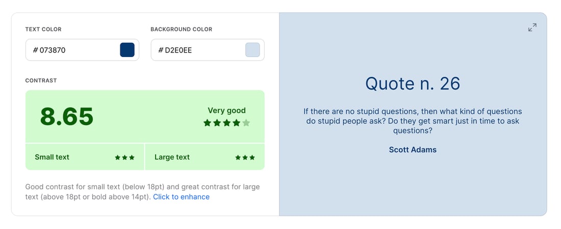
Make font and color choices based on high visibility and clear understanding. When choosing colors for your fonts, make sure that there is enough contrast between the font and the background, to make it easy to see.
Following Level AA standards, color should have a contrast ratio of approximately 4.5:1. So, you would avoid using say light green text on a white background.

Design navigation that is accessible to those with visual, motor, or other impairments. Websites that are keyboard-friendly make certain interactions possible for people who can’t use the mouse. Make sure to check interactive elements, including drop-down menus and buttons, too.
Images should contain ALT tags. For individuals with visual impairments, the alt tag in an image conveys descriptions and helps a user understand what an image is communicating.
Embedded media files, such as videos and music clips may disrupt navigation. Consider how content is formatted and included on a website. Is a PDF really the best option or can you make a page with the same text, photos and links?
Use clear text that can be easily understood. You should always offer newly-visiting users a clear image of the site’s structure, using descriptive titles and headings.
And don’t forget to test! When building a nonprofit website that is both visually pleasing and accessible, it’s important to test every aspect of your design. The best approach involves combining automated testing with manual testing. Accessibility tools exist, such as UserWay and accessiBe along with the free WAVE Web Accessibility Evaluation Tool from WebAIM and Utah State University.
In nonprofit organizations today, it is crucial that we provide a website for all our constituents. By following some simple principles you can make your nonprofit’s website more accessible and inclusive to people of all abilities.
